If you ever struggled with people leaving your site too quickly without even trying to explore it, you might be thinking: “But my website has so much to offer! The quality content, the amount of options and valuable information they can find there… And they just give up.”
Well, that‘s true. Even though the quality and quantity of the content might be outstanding, once it has too many stimuli or it looks too dense, it becomes overwhelming. Most of the time users don‘t come to your website to read every single word. Instead, they just scan it as a whole at first and catch some keywords. And if they don‘t seem to find what they were looking for within a few seconds, they leave.
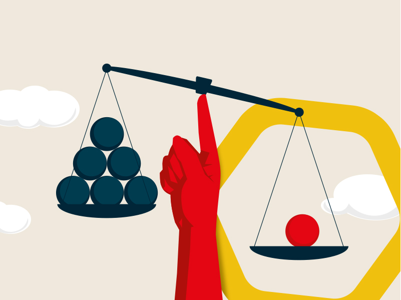
“The time and the effort it takes to make a decision, increases with the number of choices. Less is faster and easier to remember.” – Hick‘s Law
Who stands behind Hick‘s law?
Hick’s law, also called Hick-Hyman’s law, is named after psychologists Edmund Hick and Ray Hyman. The law explains how to keep users engaged on the site and how to help them with their decisions, rather than overwhelming them with immense options at once.
A jam sample experiment
The study with jam samples helps to understand this phenomenon very easily. The experiment was performed in a busy mall, where 2 stands with jam samples were placed independently.
At the first stand, shoppers had a chance to choose from 6 different jam samples. On another one, however, shoppers had a chance to choose and try some of the 24 samples of jam. The more the better! – someone may think.
The results had shown the opposite. Even though the large variety of 24 jams and creative flavors attracted more people, they tried only 2 samples on average. The same average number as when they were offered to choose from 6 jams.
Above all, only 3% of shoppers actually purchased the product when given a wide variety to choose from, which is a significant difference compared to the 30% in the other, limited group.

Frustrating vs. user-friendly real life example
Hick‘s law doesn‘t apply to choices between products only. It applies to product interfaces as well.

Let‘s be honest: How many of the buttons have you ever needed on the conventional TV remote? To make life easier, you might even see your grandma‘s TV remote hiding the unnecessary buttons under a piece of paper and duct tape. Creative solution, yet doesn‘t sound user friendly at all.
But look at the TV remote by Apple. The number of options was reduced by removing the non-essential buttons.

Applying Hick‘s Law to your website
When trying to minimize the complexity of your website, it is a good idea to start with the home page, but it doesn‘t end there. The goal is to break up long or complex processes into screens with fewer options.
High number of stimuli needs to be divided by priority. There are parts of your website that are more important than others depending on your goals. Do you want the users to mainly use search bars, or to look at the menu? Or do you just want to present them with the featured product at first?
Think about what you want your users to focus on and where do you want them to aim.
Work with visual hierarchy – the bold titles, strong colors, shapes, images and infographics can draw attention. Don‘t forget to divide long texts into smaller chunks for easier processing.
Look at Airbnb’s landing page. Not only the number of stimuli is minimized to the most important actions, There is also a clear visual hierarchy guiding the user to start searching for the accomodation. Whatmore, a complex task divided into smaller parts makes it more likely that the user will finish it.

A similar example is Kiwi. The focus is on simple searching and it is enough when the user provides detailed information later in the process. The other essential choices and actions are visually smaller, but still listed in the top menu.

How to sort out the website‘s menu?
We already talked about prioritizing the content for the landing page. When there are too many pages and subpages, it is necessary to group them into related categories and name them accordingly.
If you want to help the user navigate further on the site, you have to find out how to group and label your content the way that makes sense to your users. To apply this law correctly, card sorting is a great tool to do so.
It is the target audience – your future users, who will be involved. Present them with the content and ask them to sort it out into groups in the way that‘s the most natural to them. You can ask them to place these groups under the premade categories, or just let them name those categories themselves. It will be much easier for users to navigate through the well named and organized content. You can read more about card sorting here.

Checkout page tips based on the Hick‘s Law
There are some tips for decreasing bounce rate from checkout pages if you own an ecommerce website. How can we make the checkout process easier by reducing the distractions?
- Break the process down into more simple steps, showing the progress bar
- Remove navigation from cart and checkout page
- Have an outstanding call-to-action button
- Don‘t force users to create an account in order to finish a purchase
- When creating an account, don‘t force them into creating a complex password
- Auto-fill the form (i.e. auto-fill shipping address from billing address)