In the past decade, the popularity of Google’s suite of office tools has increased near exponentially. One of the hallmark innovations to go mainstream since 2010 has been the ability to collaborate in real-time on documents, slideshows, and spreadsheets, the lot of which were rebranded ‘Google Drive’ not long ago. In 2018, the suite reached 1 billion global users, punctuating its rampant popularity among internet users.
As with any set of writing, or visual tools, a great collection of fonts can set apart the average programs, from the fantastic ones. It goes without saying that Google, in a very short span of time has cultivated an immense array of fonts, for different users, and use-cases. Presently, there are 1005 Google Fonts to use on their programs, but we’ve compiled 6 of our favorites on this list. From formal serifs to quirky sans, here are the 6 best Google fonts, and how to use them.
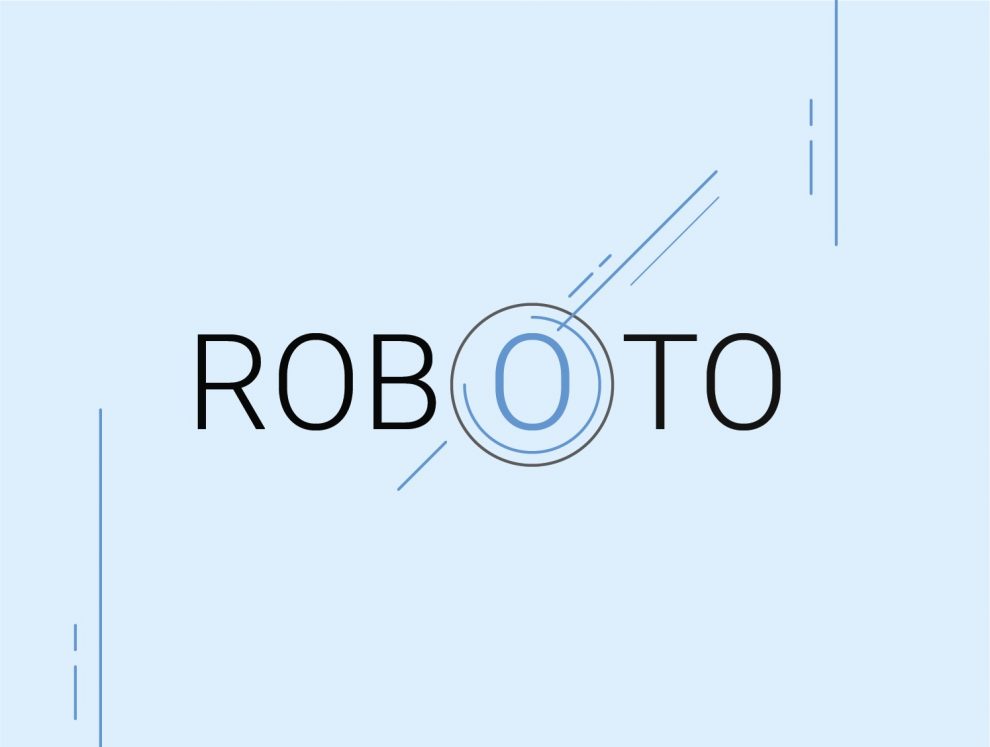
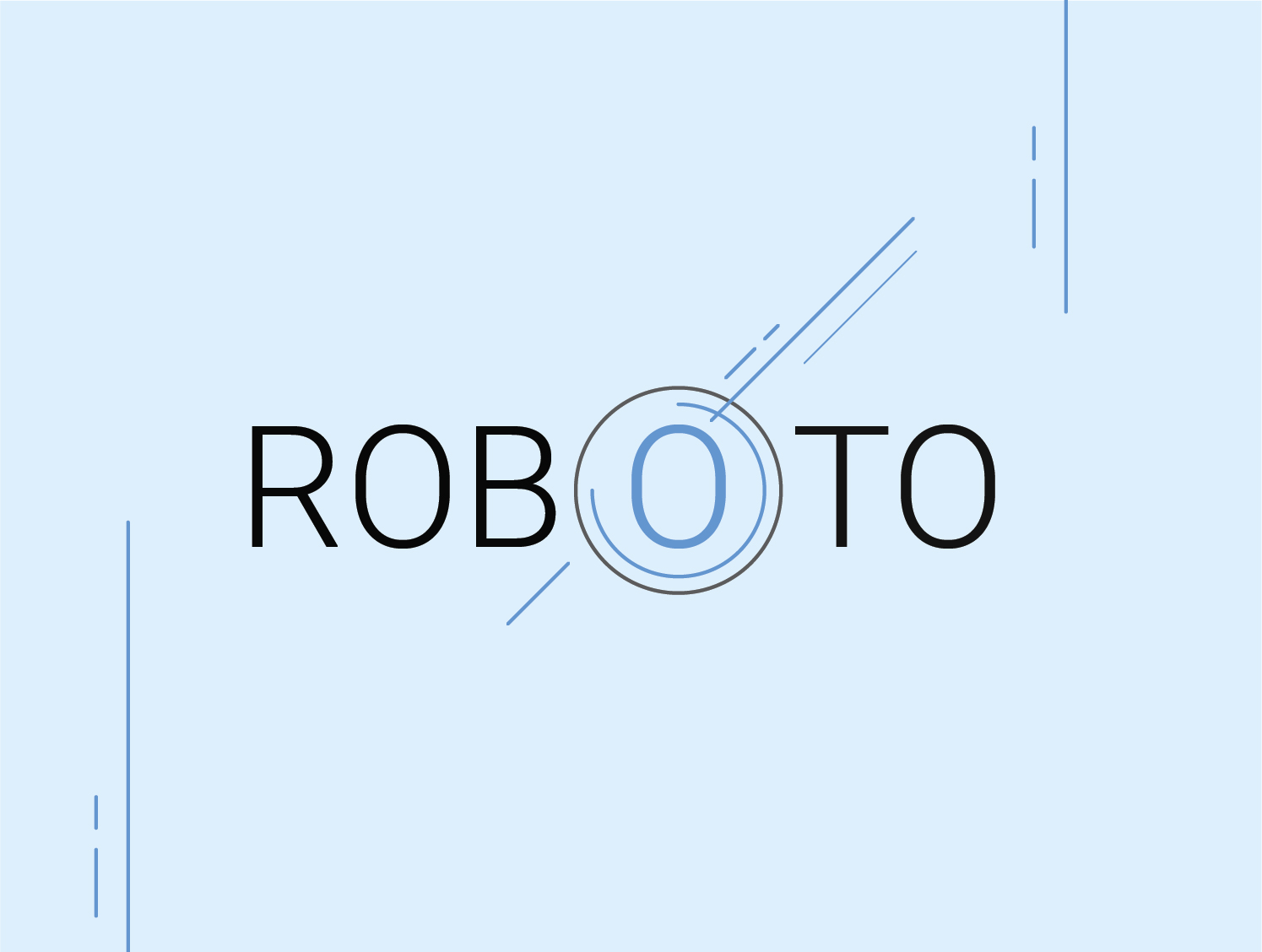
Roboto
Roboto is a font that is characterized by its duality more than anything else. It begins in the name itself, describing something inherently mechanical, but with an oddly human twist, and this is further reflected in the type itself. Roboto uses a mechanical-skeleton to craft the letters, which leads to the characters looking geometric, and standard. However, at the same time, there are curves, loops, and grotesks which give the font a lot of human character, making it visually distinct. Roboto never compromises on the width of each character, making it easy to fall into rhythmic reading patterns while reading texts typed in this font.
The designer, Christian Robertson also created two sister fonts, Roboto Condensed, and Roboto Slab, both with their own distinct-yet-familiar styles, in line with the original. The flexibility of Roboto makes it easy to pair with other fonts, some of our best recommendations would be Open Sans, Noto Sans JP, and Lato.
When it comes to the best use-cases of this font, why not take a page out of Google’s book itself? Roboto is the standard font used for all Android applications, from Maps to Google Play, not to mention other companies have adopted it, such as Unreal Engine. For this reason, Roboto functions well in app screens, where its legibility, and simplicity shines through.
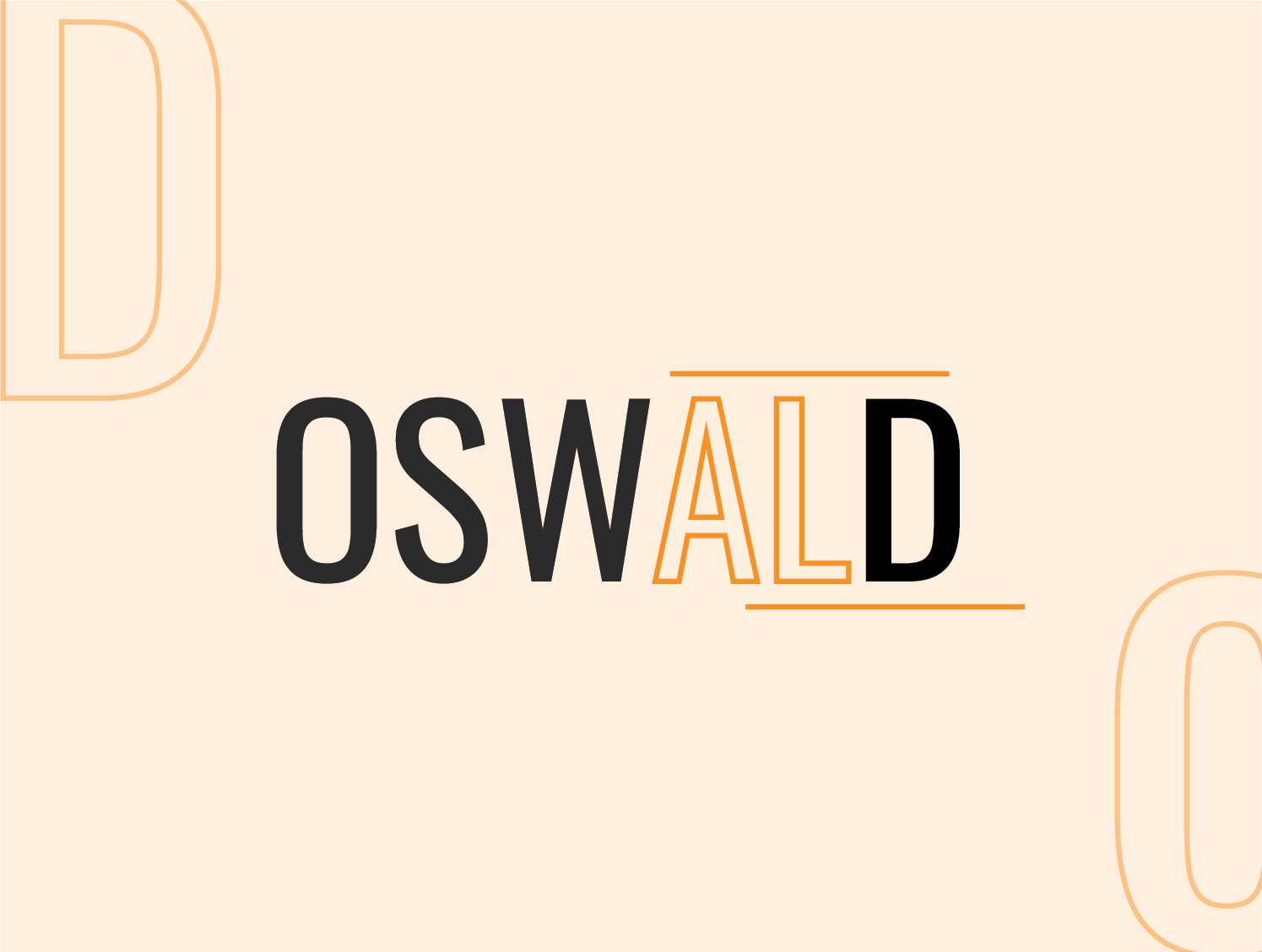
Oswald
If you’ve worked on word-processors besides Google Docs for a while, you’ll surely recognize the ‘Alternate Gothic’ family of fonts, which were variations of fonts originally used to pen some of the first books ever written in Europe! Oswald is very much a love letter to that old style of font, with modern twists to carry it into the 21st century. Very much designed with digital in mind first and foremost, Oswald looks great on screens, making it a popular choice amongst graphic designers especially.
The elongated look given to letters perfectly encapsulates the inspiration of the font, and this is exactly the look it’s creator, Vernon Adams was going for. Adams released the font initially in 2011, but has been constantly updating in with variations ever since, with regular improvements and iterations coming as late as this year! Oswald pairs great with both Montserrat (which makes an appearance on this list) and Source Sans Pro.
When it comes to uses, as mentioned, graphic designers love Oswald because of how great it looks on screens. To be more specific though, many big publications, such as Tech & All use Oswald as header fonts for articles, since it provides that distinct, newspaper-esque look.
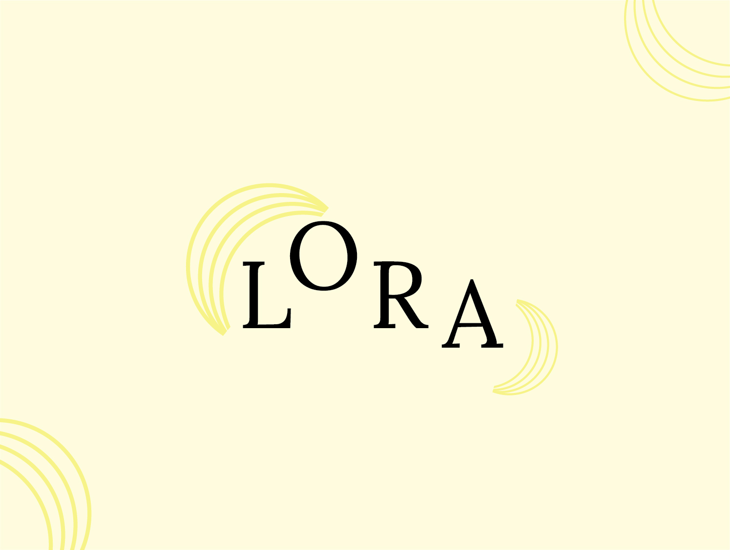
Lora
Lora is a font suited perfectly to stylized body text, and that was its intended purpose on creation by powerhouse font-maker ‘Cyreal Fonts’. With well balanced, and neutrally weighted strokes, Lora is the quintessential modern serif font, with plenty of style and character to keep it exciting, even for thousands upon thousands of words of text.
While Lora, like Oswald above, is very much optimized for screen viewing, it works equally well on paper and works great for long-form text like novels. While most serifs are angular and mechanical in nature, Lora makes brushed strokes elegantly upon the characters making the phrase ‘a picture is worth a thousand words’ come to life. Lora pairs well with fonts like Lato, Raleway, and the aforementioned Roboto.
Lora can be used to great effect as mentioned in the long-form text, but it has many other functions. Large quotations for example benefit from Lora’s kinetic strokes, making them more animated in nature. This, in turn, adds a lot of character to interviews, magazine covers, or accompanying a portrait.
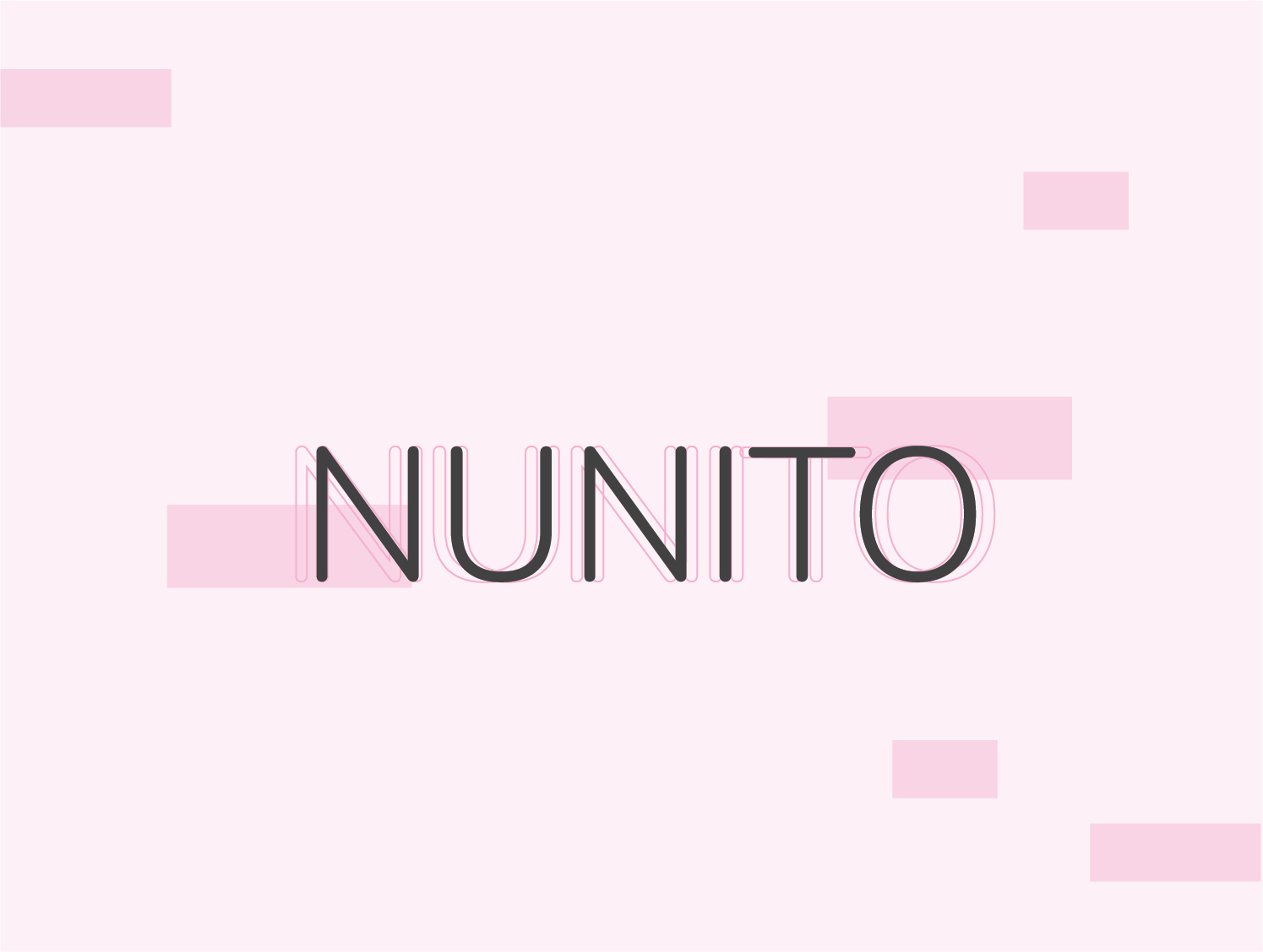
Nunito
One of the sans serif fonts on the list, Nunito is another masterwork typeface from Vernon Adams, the creator of Oswald. However, Adams can’t take all the credit this time as he simply created the display typography with one weight, where Jacques Le Bailly came in, and fleshed out the font to encapsulate all kinds of weights, and styles. Nunito is a highly versatile font, looking basic, and highly readable at lower weights, gaining far more character and charm as the type becomes thicker. Nunito can be likened to the lettering done in old-school comic strips, grounded enough for easy reading, but with enough exaggeration to make it an exciting visual.
As a result of its versatility and dynamism, Nunito pairs well with any number of fonts not just available on Google platforms, but anywhere else as well. We would particularly recommend matching it up with Poppins for design purposes, and Roboto for reading.
Nunito has found quite the niche when it comes to organic, or vegan products since it’s light strokes somehow pair greatly with ethically produced or sourced products. Nunito’s rounded letters also work great in holding the attention of children, and could be applied in novels, or messaging for younger audiences.
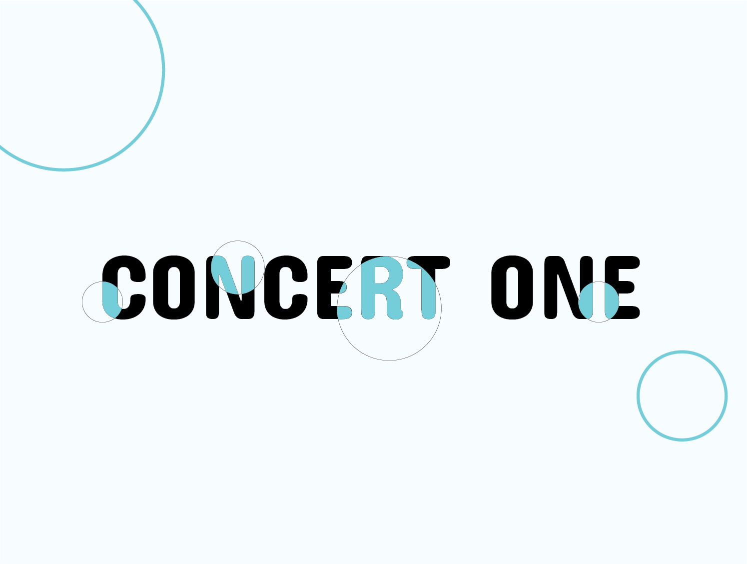
Concert One
Concert one is one of the most charming fonts available on Google platforms without a doubt. It’s unusual lettering, curves, and grotesks make it strangely attractive in an indescribable way. There’s only one weight for the font, which is a negative against it, but the one featured perhaps wouldn’t look nearly as good with lesser stroke weight.
Unfortunately, history wise, very little is known about Concert One besides a few minor details. The creators, Johan Kallas and Mihkel Virkus stated that the font was inspired by a 19th century chamber concert invitation, hence the name. In terms of pairings, PT Sans, Work Sans, and Roboto Slab all work great as body pairings to a piece headed by Concert One.
Concert One’s most applicable use takes it back to its roots, in posters and print media. When printed, the font gives an embossed appearance, lending plenty of style and character to any piece of text. It’s inadvisable to use Concert One for body text, and thus isn’t great for long-form content.
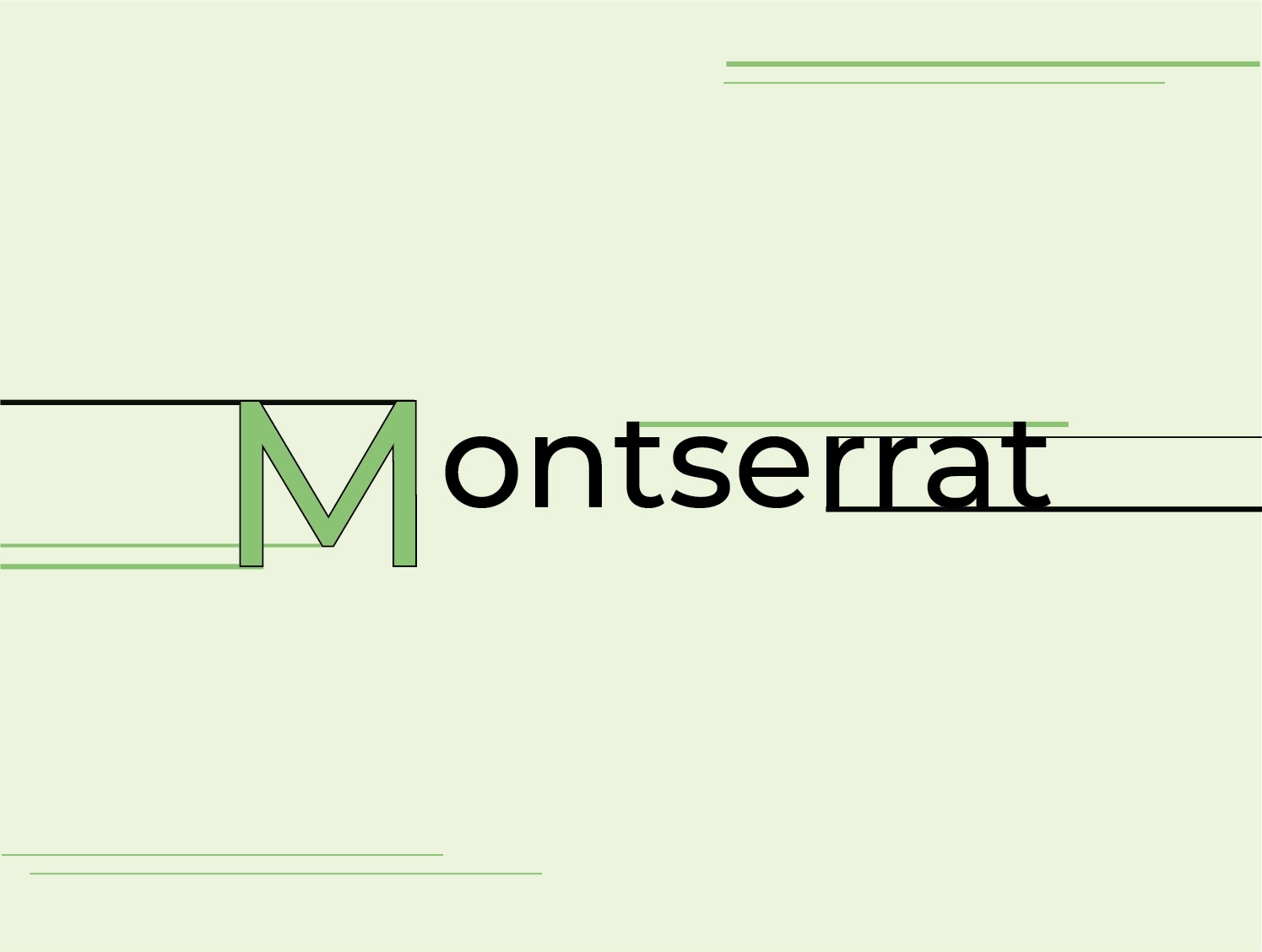
Montserrat
Lastly, we come to Montserrat, one of the most recognizable fonts in the entirety of Google’s ever-growing arsenal. Inspired by the street signs and posters of the titular Montserrat street of Buenos Aires in Argentina, Julieta Ulanovsky created a free version of the font to be used digitally much later in the type’s lifespan. The letters make for clear, easy to read text, the legibility of which is heightened by the proportions of the characters. Kept shorter in height, and wider in stance, Montserrat’s characters are well suited to both screens, and print.
Montserrat was revised in 2017 by Jacques Le Bailly (who you’ll remember did the re-work of Nunito as well), this is truly when the font broke into the mainstream, and became synonymous with the Google font family! Common pairings for Montserrat are Open Sans, Raleway, and Lato.
Montserrat is a jack-of-all-trades kind of font, it’s readability makes it great for large pieces of content, while it’s curves and quirks make for great headings as well! Additionally, it looks equally great in print and on screens. As such, if you’re a big fan of material design, and want to have uniformity on a site, magazine, or paper, Montserrat could fill your needs perfectly.
Conclusion
All told, Google has a massive array of fonts to utilize on their various platforms, and the list is only growing as time moves forward. While downloading fonts, and experimenting with combinations of one’s own accord is enjoyable for many, Google has more than enough options and variety to keep even the most passionate of typophiles busy for days on end!