
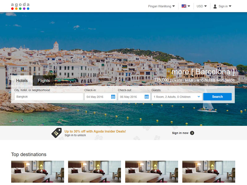
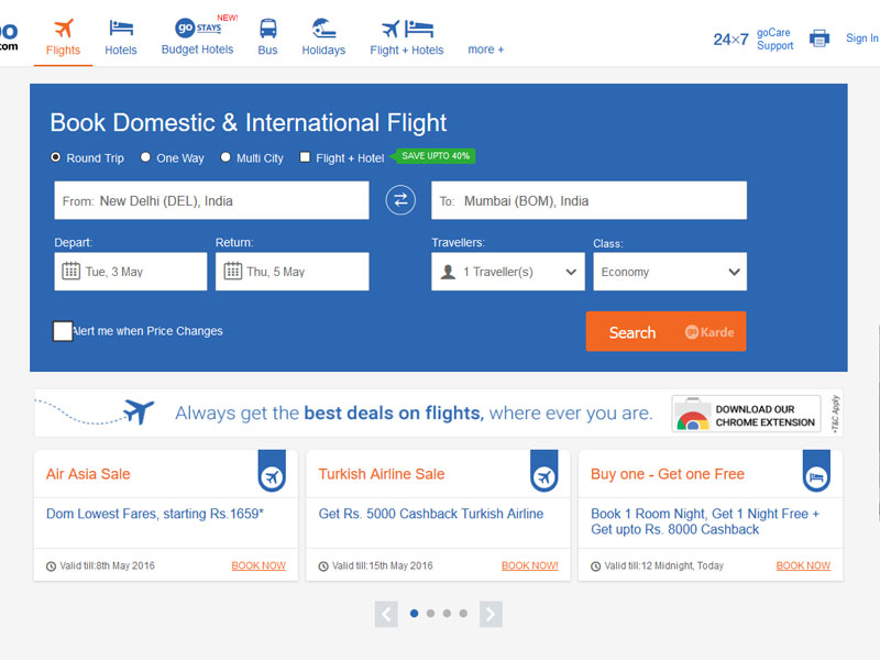
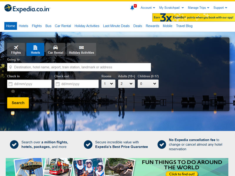
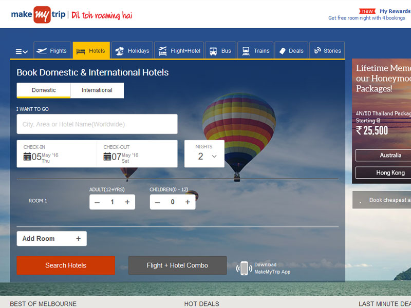
Web forms are used in many ways, Web users fill out the forms with the help of check-boxes, radio buttons, or text fields. For example, web forms can be used to enter the credit card information to order a product, or to search relevant results by using any search engine.
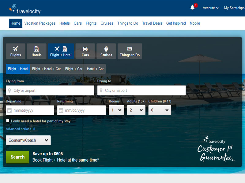
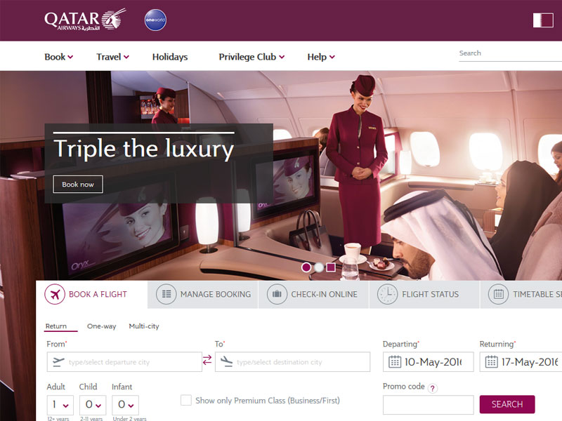
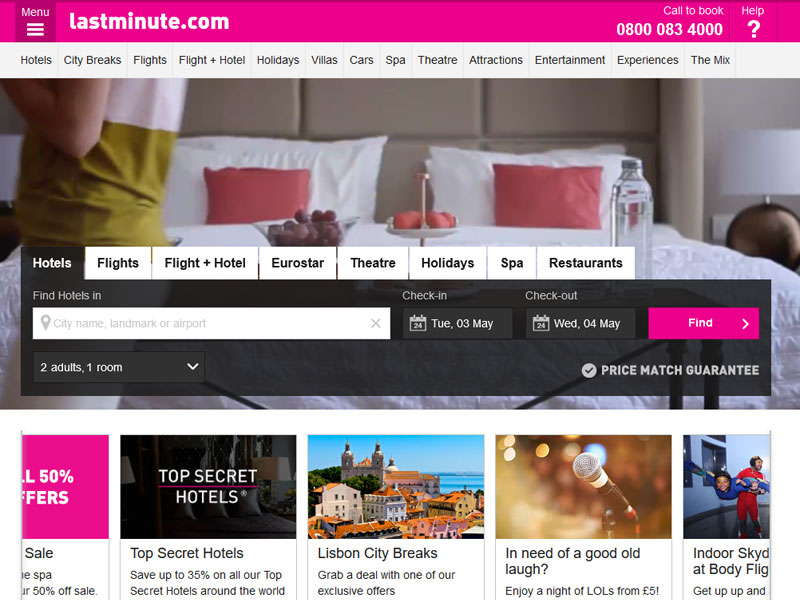
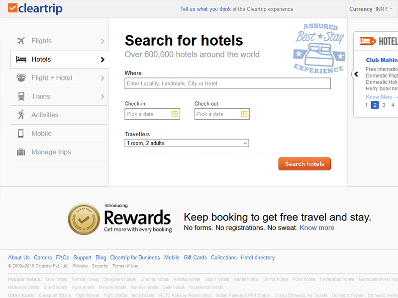
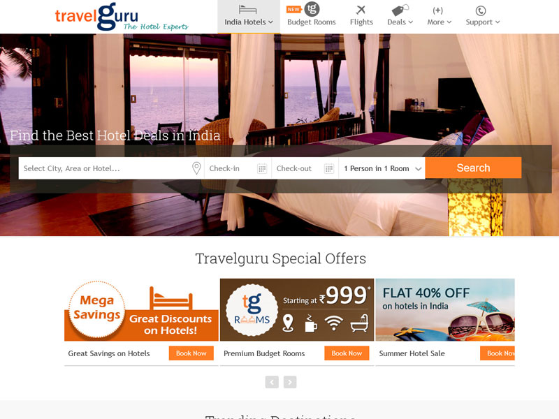
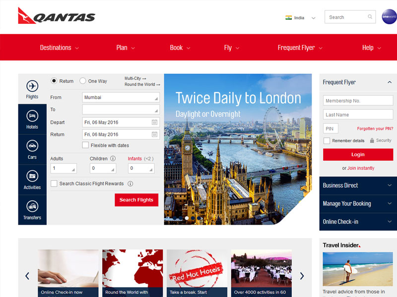
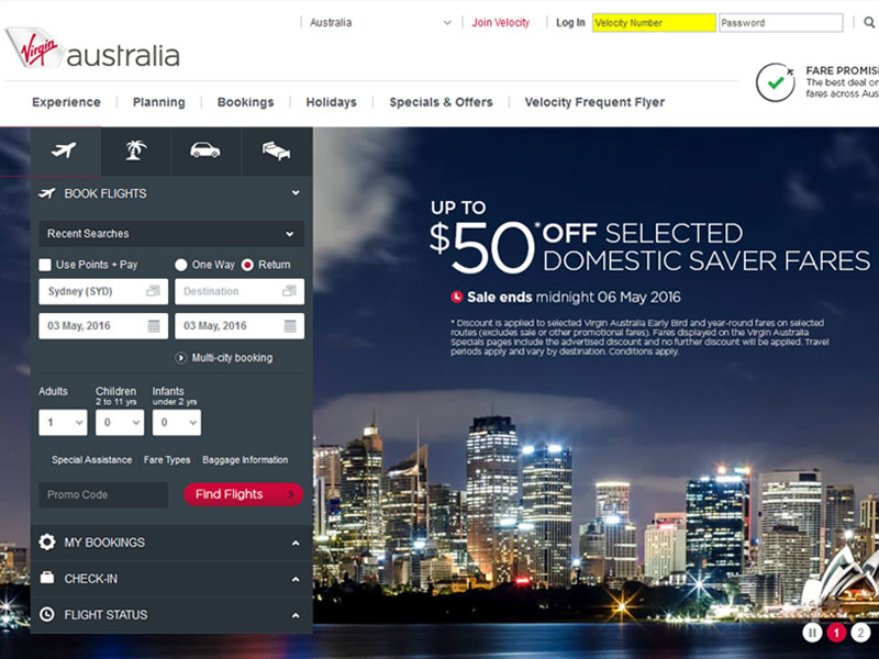
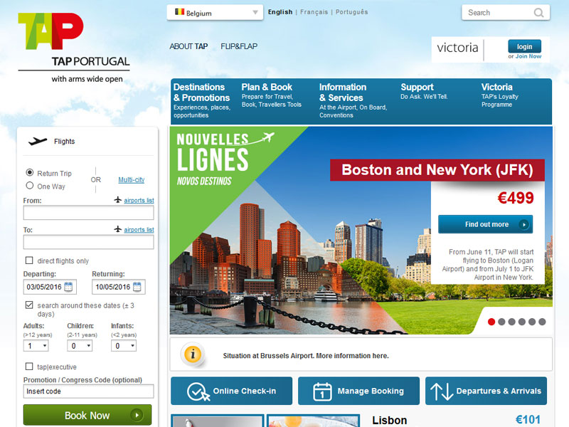
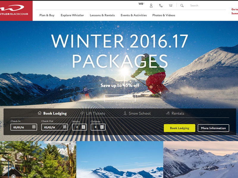
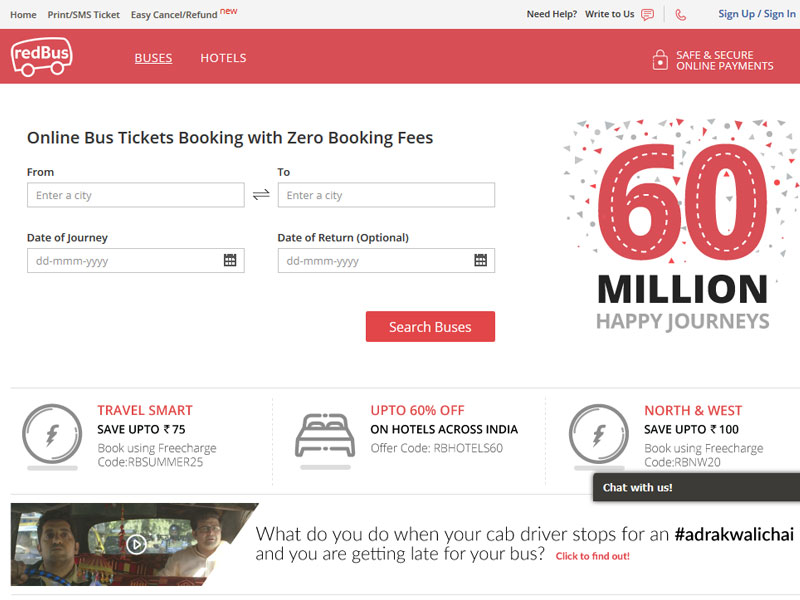
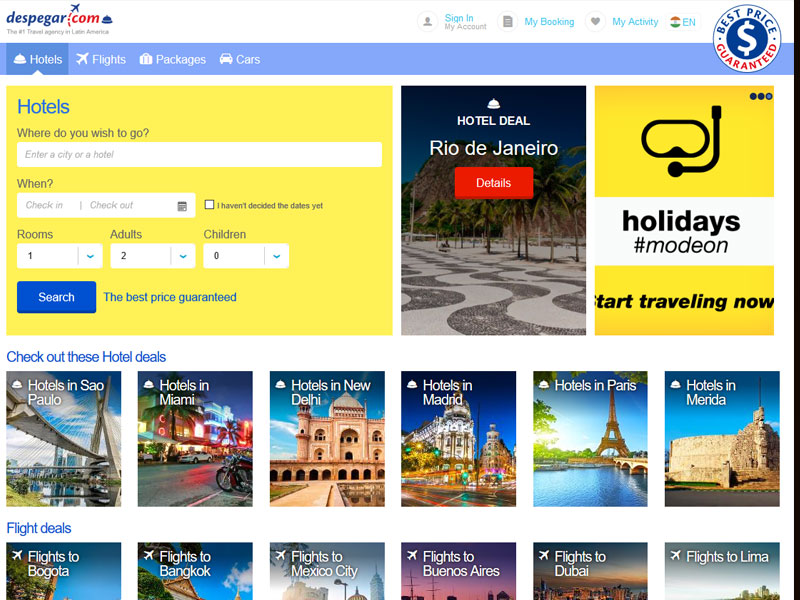
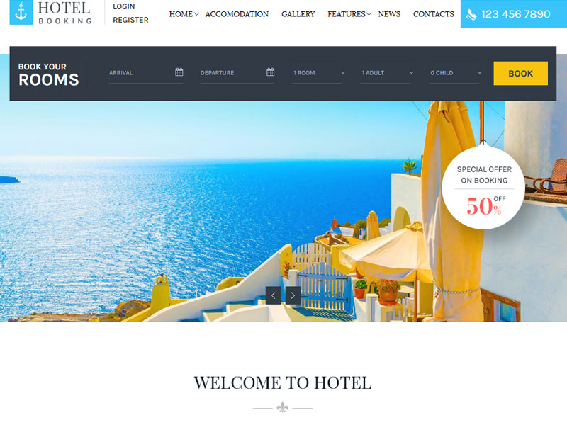
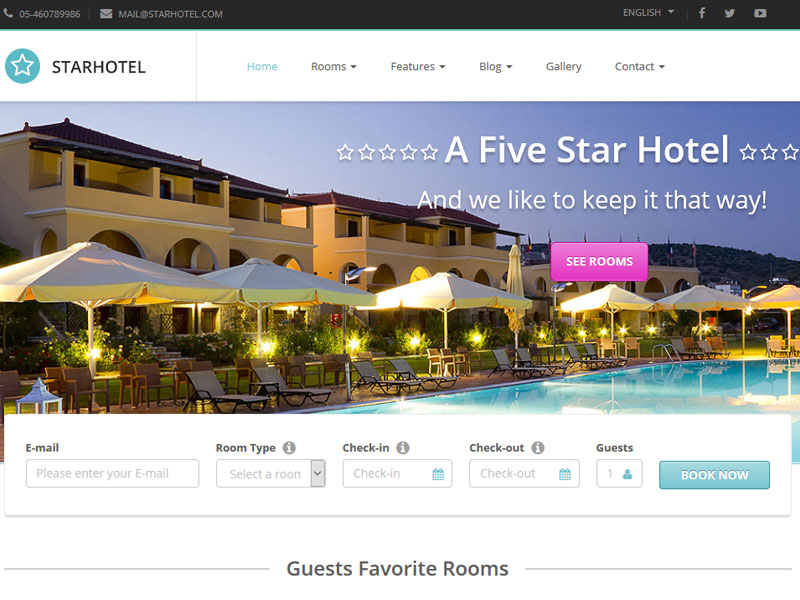
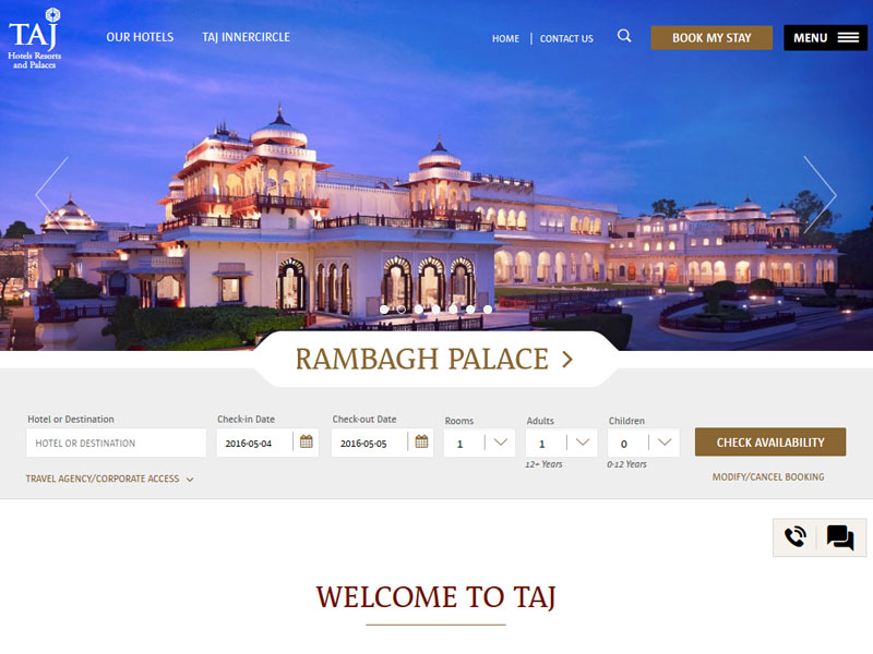
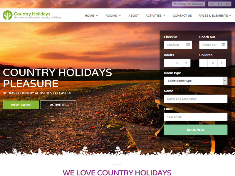
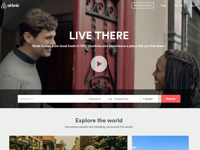
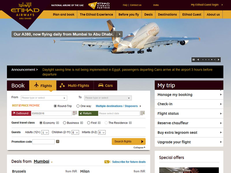
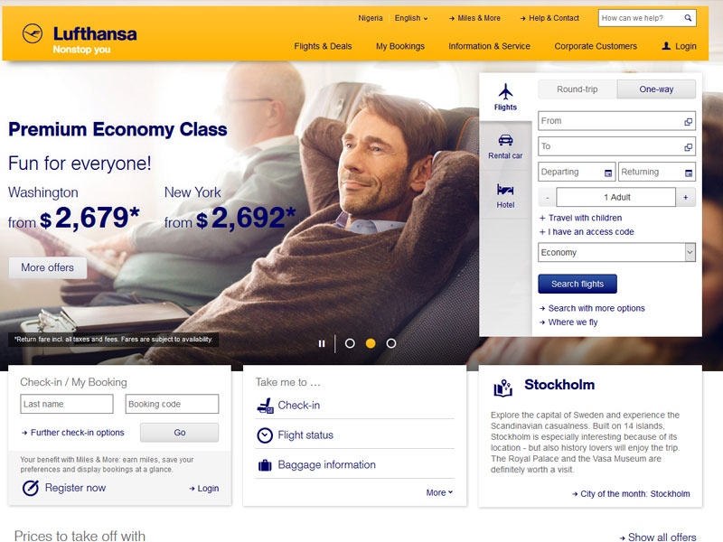
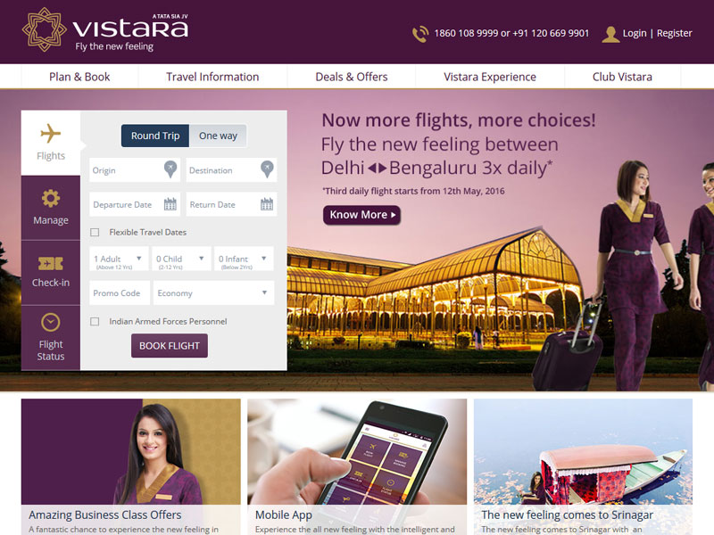
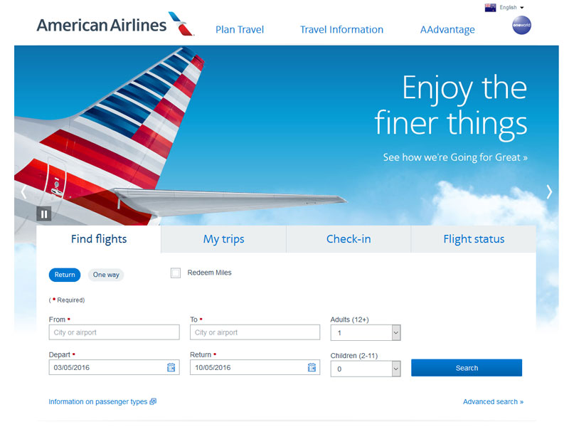
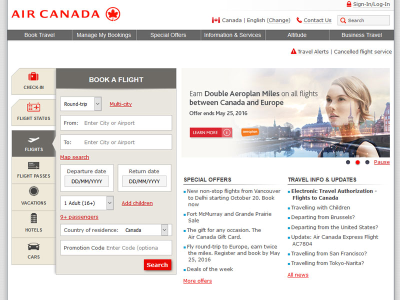
Below is the listing of some of the best on-line booking forms captured from various on-line websites.


Thanks for the collection.
I’m interested to hear why you’ve called them out as “the best… you have ever seen.”
I claim to have designed the first online booking form while at Travelocity. (Anyone care to dispute? I’ve got some really old wireframes! See Wayback – 1998 http://goo.gl/OvrtMB ). We updated the basics when we added booking packages ( http://goo.gl/9vN8Li ).
I even designed an industry-leading booking approach, Flexible Date shopping, using a form with only two text fields and one drop down ( http://goo.gl/xoeoCM ) … once called the “sort of Holy Grail of Travel!” – 1999 Washington Post ( http://goo.gl/18Tp5H )
Today’s collection looks pretty homogeneous. The visual designs match their sites (for the most part). Some are responsive while others have a mobile-specific solution… But there’s not that much complexity that has been/or should be introduced…
But wait! What about the calendars?
I think where the biggest design distinctions still occur with the booking form set is in the calendars. That’s something worth showing a collection of and opening up for some discussion.
– How many clicks does it take to select your Outbound and Return dates?
– Is it clear which date is selected and for which part of the trip?
– How many months should you show at one time?
– How easy is it to change your date selection?
– Are the dates carried through from one part of your trip (air) to the next (hotel) – and again, is it easy to change?
– How does selecting dates translate into mobile? – Is it different for tablet (and do we still care) than for phones?
Thanks for the ramble space and for the nice snapshot in time capturing the current state of booking forms! I am interested to know why you think these are perfect. If it was just a hyped-up title to catch my attention and you don’t really think they’re the perfect, well… you got my attention. But I do feel a bit duped.
– Noel Holmes
Hi Noel Holmes,
Many thanks for spending your valuable time to read our article. We are always in seek of response from our readers to know how well we are doing.
Below are my comments for your kind query:
We have gone through the links that you have shared for booking forms e.g: (http://goo.gl/OvrtMB, http://goo.gl/9vN8Li, http://goo.gl/xoeoCM, and http://goo.gl/18Tp5H), We believe that the forms used in these links are good (based on the year when it was created). As I can see these forms were designed during the period of 1990’s and Now its 2016 – lots of things has been changed during this period (1990 – 2016). The website that you have referred (https://www.travelocity.com/) itself is been updated, and it actually looks awesome. We need to go-along with the market trend which is must.
We have experienced links of UI & UX persons who help us in our articles, I myself belongs to UI/UX field and has more that 14+ years of experience.
There are many aspects why we called them out as “Most Perfect Online Booking Forms”, we judge the designs on the basis of:
– Usability (Key Factor)
– Clarity in a user interface design (Fonts, Spacing & Padding)
– Design should be concise
– Use of Colors
– Should be Responsive (If Possible)
– Overall consistency
– Effectiveness etc..
The design should meet most of the above parameters.
Hopefully these address’s your queries.
Regards,
Vivek
Hi Noel Holmes,
Many thanks for spending your valuable time to read our article. We are always in seek of response from our readers to know, how well we are doing.
Below are my comments for your kind query:
We have gone through the links that you have shared for booking forms e.g: (http://goo.gl/OvrtMB, http://goo.gl/9vN8Li, http://goo.gl/xoeoCM, and http://goo.gl/18Tp5H), We believe that the forms used in these links are good (based on the year when it was created). As I can see these forms were designed during the period of 1990’s and Now its 2016 – lots of things has been changed during this period (1990 – 2016). The website that you have referred (https://www.travelocity.com/) itself is been updated, and it actually looks awesome. We need to go-along with the market trend which is must.
We have experienced “UI & UX Professionals” who help us in our articles, I myself belongs to UI/UX field and has more that 14+ years of experience.
There are many aspects why we called them out as “Most Perfect Online Booking Forms”, we judge the designs on the basis of:
– Usability (Key Factor)
– Clarity in a user interface design (Fonts, Spacing & Padding)
– Design should be concise
– Use of Colors
– Should be Responsive (If Possible)
– Overall consistency
– Effectiveness, and etc..
The design should meet most of the above parameters.
Hopefully these address’s your queries.
Regards,
Vivek
[…] Web forms are used in many ways, Web users fill out the forms with the help of check-boxes, radio buttons, or text fields. […]