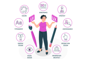
Although it may seem like it’s magic, a good UX design never comes out of nowhere. It is not even a product of a great idea or imagination. In reality, a good UX design is a result of carefully plotted design elements. It is not about a collage of pictures that were carefully arranged but rather a harmony of different visual elements, which not only are unequivocally outstanding but also tell a story. Adding a cinematic touch to digital art through UX/UI can produce graphic illustrations of gliding fantasy lands, cities, and seascapes. An Art Video installation could be displayed in museums and exhibitions, or as video depiction behind a music concert and opera.
Hence, a good UX design, in a nutshell, is one that is not only pleasing to the eyes but is also able to convey a clear message. An expressive UX design can also win a lot of hearts on the Internet. For instance, one can upload a sample on Instagram to see the response. However, if a lack of followers is restricting the UX design to gain more appreciation, then one might consider the option to buy IG followers for more exposure.
Anyway, in order to craft meaning and make muddled ideas clear in a UX design, one must be aware of the elements of art and principles of design. They are what you will need to make any design be as powerful as it can be.
But what are the elements of art?
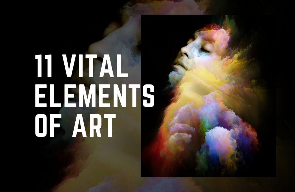
Below is an overview of the 11 vital elements of art that graphic and UX designers should live by.
The Elements of Art
The “Elements of Art” are simply a set of guidelines that encompasses graphic design basics. They are considered to be the fundamentals of the subject that will serve as the ultimate tips for designers. These concepts are so simple and yet can be utilized to create professional-quality pieces once you have mastered it.
1. Focal Point

A visual design is often complex and the brain seeks the relationship of its different components. A point is the area where coordinates meet and serves as the focus of the design. It draws the attention of the viewer so that the brain can become oriented to the outline of the design.
Once the mind has landed on the focal point, it will develop strategies to understand the meaning behind the visual stimuli. By providing the point of orientation, the brain will see the connection or the relationship behind all other elements thereby appreciating the design as a whole.
2. Line

A design is almost impossible to create without utilizing a line in some form. A line is actually considered as one of the most important foundations of art for being so versatile. There is nearly an endless potential as to using this design element. As its definition suggests, a line is created when a point is moving in space, creating an identifiable path.
A line can vary according to length, width, and direction. It can define edges, give a three-dimensional effect, and even elicit psychological responses.
3. Shape

A shape is a product of closed lines where it appears as a two-dimensional figure that is flat and has both height and width. Its boundaries are defined, making it perfect to emphasize some areas of the design.
Depending on the artist, a shape can either be organic or geometric. Organic shapes are those that are normally found in nature and are usually having either a flowing or curvy form. In contrast, geometric shapes are created when uniform measurements are applied on the lines as what you can see in squares and triangles.
Shapes have different characteristics that can evoke moods and let the viewer convey different meanings. They are used to create a sense of movement to the design, leading the eye to see from one design element to another.
4. Color

A design’s color must be balanced and contrasted appropriately. The saturation and brightness should be considered for each color. More than the basic composition, however, one must be able to learn the basics of color theory in order to identify the best colors that have the right tone, temperature and mood.
When we talk about color theory, it is more of understanding the psychology involved when using colors. The brain reacts very differently according to what colors are seen by the eyes. Notice how fast-food chains use red on their logos and campaign materials? This is because aside from being associated with love and other aggressive emotions, red triggers hunger with a lot of people.
Other factors of color that trigger emotions are tone and hue. The warm tones might bring out positive emotions, whereas cold ones might prompt negative emotions. Understanding these psychological triggers to use them practically can be ambiguous. However, to help with that, a customized Adobe color wheel for Photoshop and Illustrator can be procured. These color panels can have features such as crystal glass blur, tone lock, bigger color swatch, etc., which further might make the emotional stimulation smoother.
Knowing about which colors to use gives you the power to awaken a wide range of emotions, especially those that can help set a specific mood and provoke different feelings that you are aiming for.
5. Form

A design usually has a shape that appears two-dimensional. Once depth is added and it becomes 3D, it is now referred to as form or the positive element. Some common examples of form are spheres, cylinders and pyramids.
Form also helps in evoking moods and meanings to a design. It somehow creates a sense of movement within a piece, leading the eye towards other design elements thus creating different viewing pleasure from any perspective.
6. Value

Value is somewhat related to color but more on its lightness and darkness wherein white is the lightest value and black being the darkest. The difference between the two values is referred to as contrast.
Just like how colors affect the mood of a design, value creates interest in a piece, influencing its character and how the human eye interprets it.
7. Space
One of the tricks of an artist is creating an illusion of depth to a flat-looking surface. It is created by organizing the different elements above, below, and within the design components. The active and visible distance within the elements is called space.
A space can be positive when the area is occupied by an object while a negative space is the area that is left blank. A balance is created when the artist is able to create rhythm, in the contrast that is produced within the composition.
8. Texture

Texture is a fun element that adds realism to any design. It appeals to the sense of touch to evoke feelings, whether it is delight, discomfort, or nostalgia. A two-dimensional design may not give that literal feel on a surface. Texture allows the viewer to generate a visual perception of the expected sensation.
Texture is created when other elements are combined, like color, line and shape, to draw attention and create balance. It can either be actual or visual. For actual or real tactical texture, the viewer can feel it through the thickness of the material, whether it feels rough or smooth, and if there are additional embellishments like glitters, etc. As for visual texture, an illusion is created using other design elements or through modern methods, like a graphic design software.
9. Size and Proportion

Size and proportion often go hand in hand as they both bring balance and contrast to the design. With size, the actual dimensions of the different elements are taken into consideration. Proportion, on the other hand, makes it possible to emphasize the difference in size between objects.
Size and proportion allows you to add both interest and emphasis to an otherwise boring and overly symmetrical design. The subtle differences in size can highlight different information for the viewer and define shapes.
10. Direction

Another way to create movement within a design is the use of direction. This element can establish the mood and general atmosphere of the design. It can be done using horizontal and vertical lines to direct the viewer towards a particular perspective.
With direction, you need to be certain as to what kind of lines to use on a particular area of the design. Vertical lines, for example, will evoke a balanced, alert, and formal atmosphere while horizontal lines can translate to peace, stability, and tranquility. If you are to create a sense of movement among objects, oblique lines may be used.
11. Symmetry

Symmetry is one of the two schools of balance with asymmetry as the other. It refers to the visual quality of the objects that are laid across an axis, usually along a path or centered on a focal point.
The principle of symmetry is generally about making it seem like everything on the design is equally weighted. Doing so helps create harmony and order that contributes to the overall aesthetic quality of a design.
Harmony in Design
At the end of the day, creating harmony is the ultimate goal of a design. All the aforementioned elements must work together to create a sense of balance. The design should create a visually satisfying effect on the viewer.
As a UX designer, you must consider making all the elements become unified in a certain way. One way to do this is by repeating the design elements across the composition. When using colors, for example, uniting them can be achieved by having colors that are under a compressed value range. This will give cohesion throughout the design.
Your Turn…
Art is subjective but these eleven elements of art can guide you towards elevating the design in order to create effective compositions. Making the slightest adjustment to any of these elements can be the factor that will define the overall visual quality of the design. This is precisely why you must aim to master using these elements, so you can create more than art but something that is meaningful not only to you but also to the audience.
What makes it fun to know about these elements is that they are easier to apply using modern design-creation methods. Digital arts are on the rise and more artists are trying to replicate traditional art into digital forms using gadgets such as iPads. With some designers, internet-based applications, like Procreate, Pixteller, Canva, Photoshop, Webflow and Removal.AI for photo editing and graphic designing, come handy as it makes achieving harmony in their design easier.
There are possibly hundreds of rules, elements, and principles of art that can help you create beautiful designs for a better UX but these eleven are the most basic essentials that should get you started. One thing that is left to do is to take these elements into practice. Being consistent in using these elements plus mastering different technological advancements are the keys to having the power to create expressive designs.