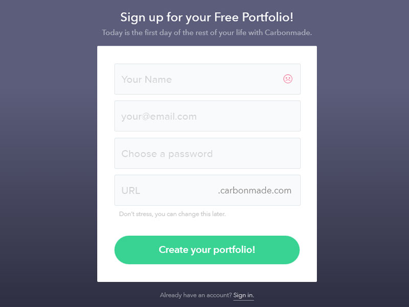
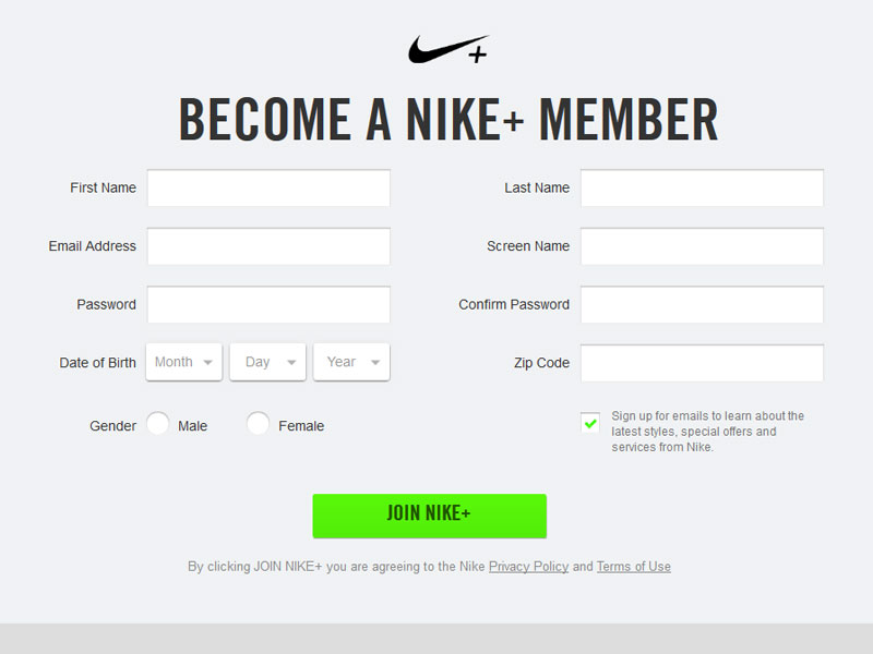
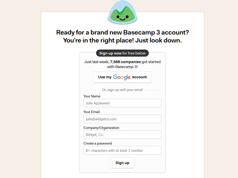
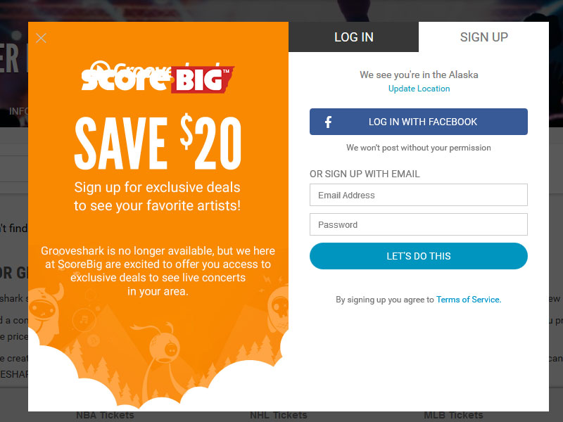
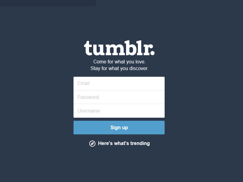
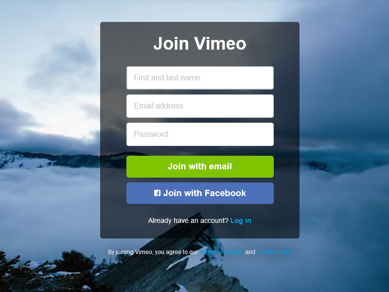
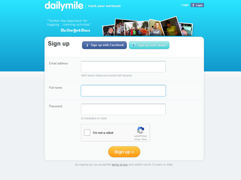
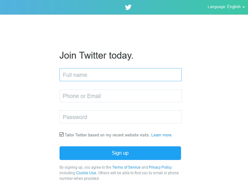
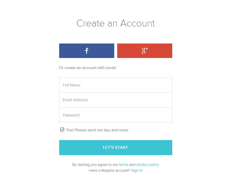
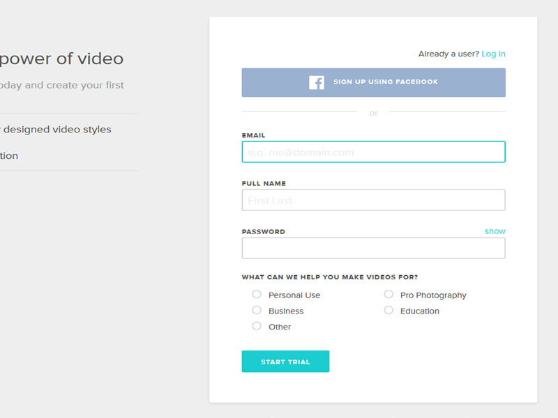
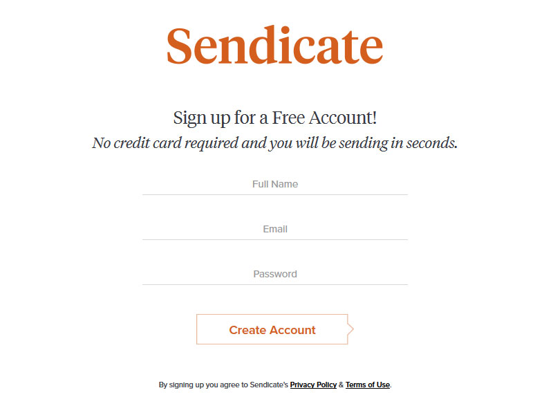
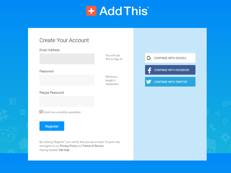
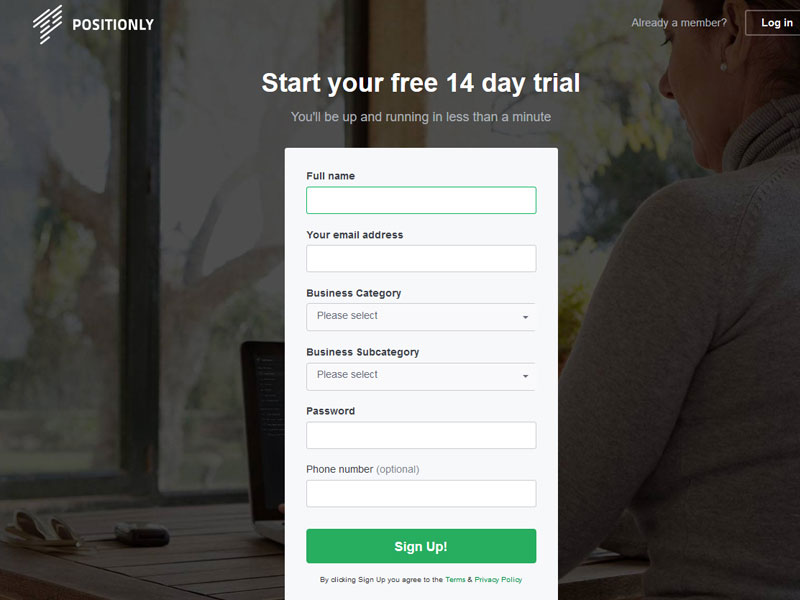
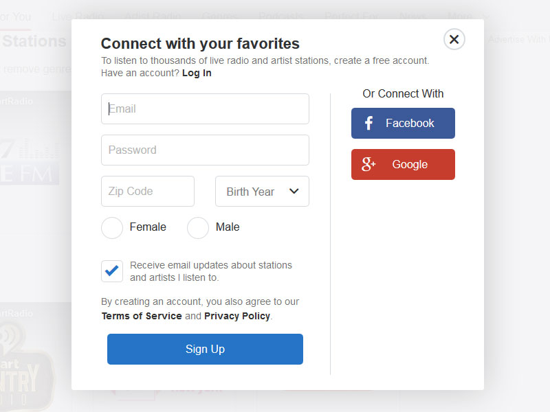
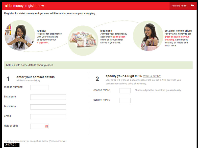
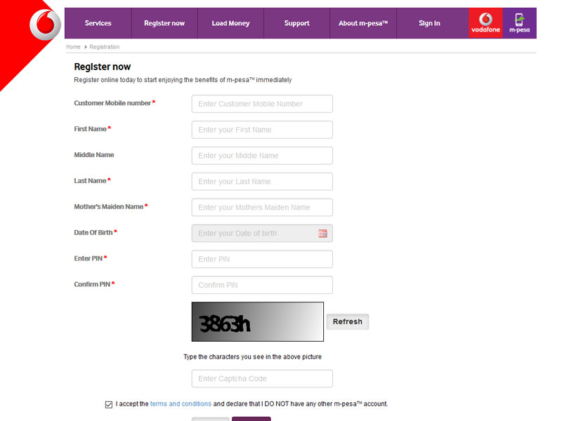
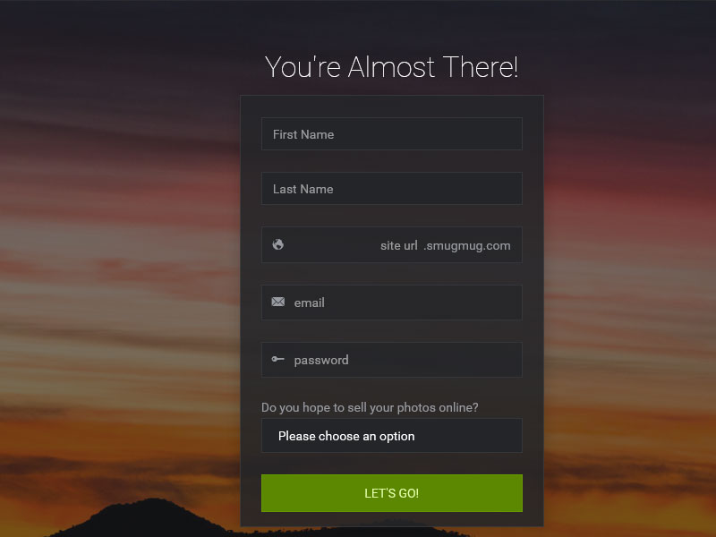
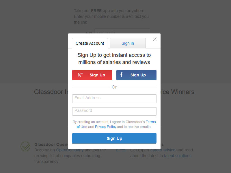
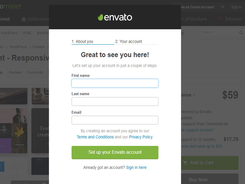
A Sign-up page should be clear, concise and easy-to-operate. It should be a passage to services and products that the user wants to access and not a resistance or a barrier. The visitors attention on the internet is just 8 seconds and you need to grab those 8 seconds to make the visitor hooked on to your site for a long time.
Here are some points to consider before designing a start-up form
- Is the username necessary to incorporate or will the email id be enough?
- Are the fields big enough for the user to right easily?
- Make sure the sign-up button is big enough to tap and does not ‘hang’ and functions efficiently.
- There should be minimum input rows, in case there are too many fields to be filled, and the user tends to lose interest and drifts away.
- The page should have minimalistic details about other irrelevant things like adds, notifications etc.
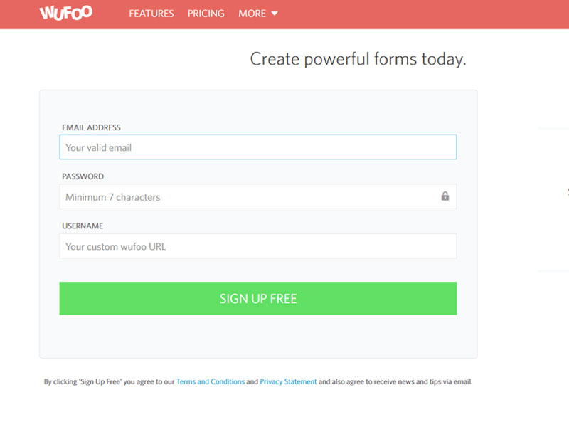
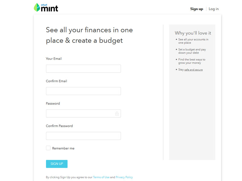
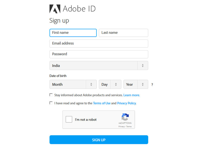
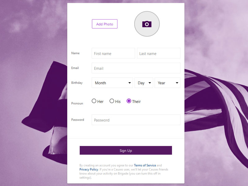
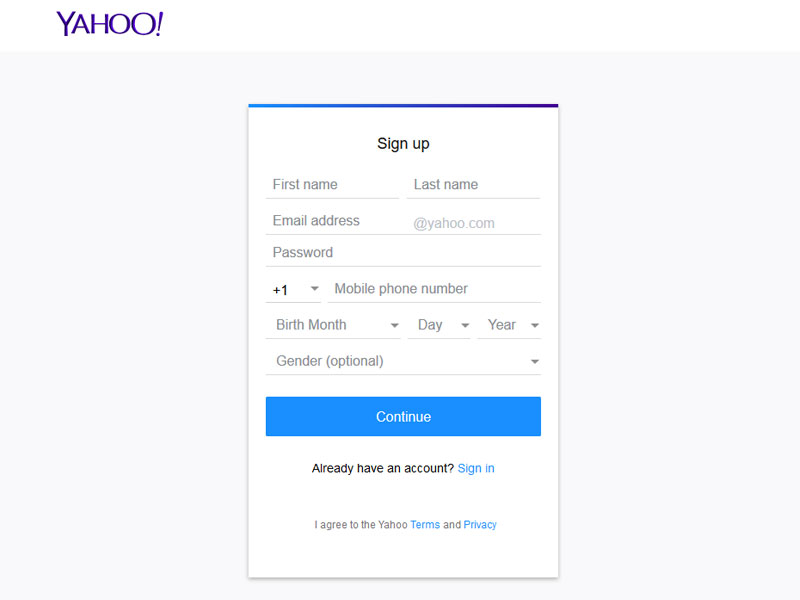
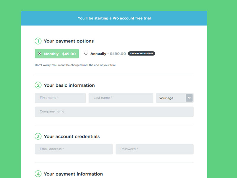
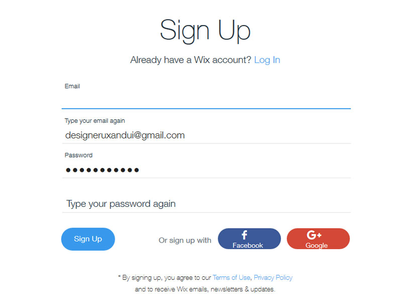
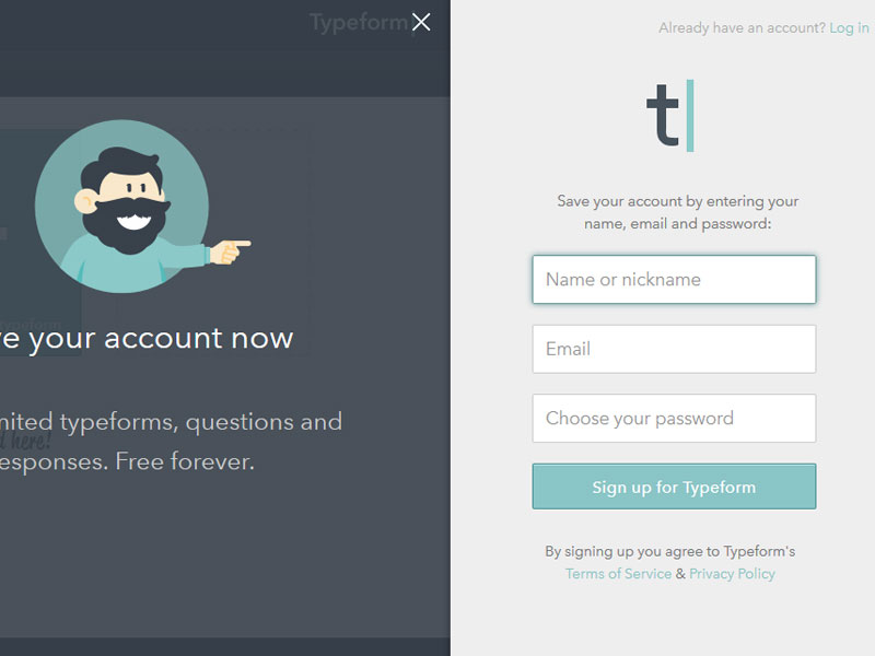
Keeping these features in mind let us check out the 30 best sign-up forms below