Trends are everywhere. They are what keep us connected as a society and upping the bar on what is deemed innovative and new. In creative spaces, trends are extremely important because they directly affect consumers and businesses. Many people who have been web designers melbourne for a while know that web design is always evolving and each year brings about new trends and new design demands.
If you are just getting hip to the program you may have realized that the New Year in full effect- bearing that in mind, there are a few things that UI/UX designers want to be mindful of. In terms of design, 2016 is all about user friendliness, simplicity and functionality. More simply put, minimalism is key. If you’re looking to use a specialist agency that creates e-commerce websites, you should be aware that these trends may be seen clearly in your website.
The thing about UI/UX design is that it is easy to get carried away. There are just so many different ideas and models to play with and we aren’t just talking about what our viewers see but also what the actual website design is mapped out.
Monochromatic Color Schemes
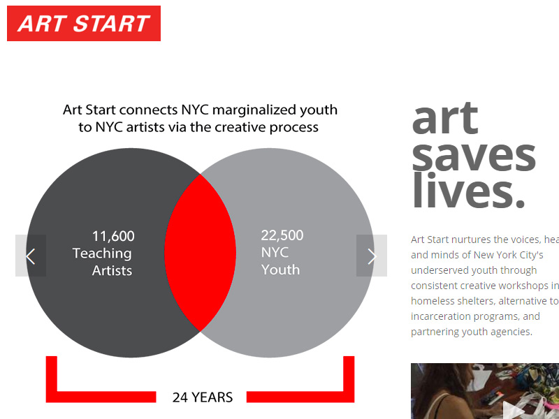
When it comes to physical design attributes, you will definitely be seeing more basic monochrome color schemes. Monochromatic color schemes can be nice and professional while still being fun and engaging. You will definitely be seeing pages that utilize CTA playing with this fun design idea while makes their CTA buttons a bright ‘pop’ of colorful goodness.
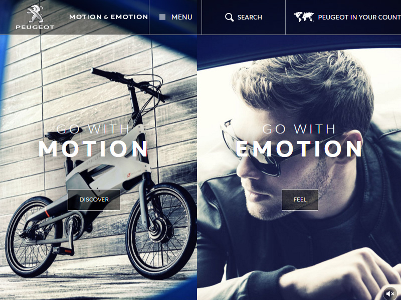
Split Screen Style Layouts
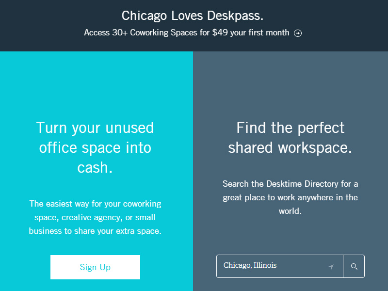
Want to really keep ‘em guessing? Split-screen style layouts are the way to go. Split screens are great web design tools for people who sell multiple categories of goods or have a website that serves multiple purposes. One half of the screen can be men’s clothing and the other half women’s clothing. Get the idea? Since it is thought that most People only read about 20% of a page they click on, this design could be highly effective in showing the viewer everything they may be interested in, improving the efficiency and making for better user experience.
Sticky CTA Buttons
With small businesses booming across the globe there is no wonder why sticky CTA buttons are becoming all the rage! Sticky call-to-action buttons will scroll along with the content as the viewer browses around eventually piquing their interesting and possibly inciting a lead or sale.
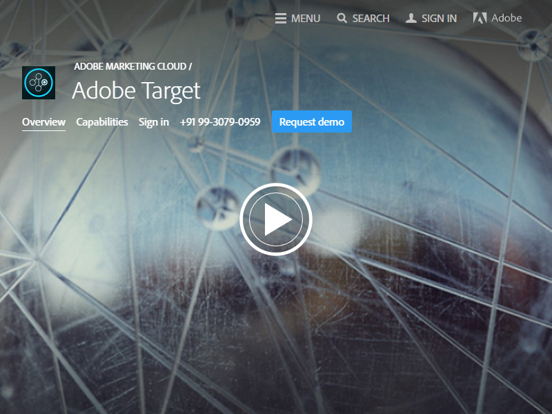
Website Personalization
One of the biggest web trends this year will definitely be website personalization. More and more consumers are hitting up the web for their needs so you’ll want to customize their experience. This nifty tool allows your page to track the consumer’s history and display it for them. Sort of like what Amazon has going on at the moment.
Mobilization Of Websites
In 2016, web designers will want to play with a wide variety of fluid themes and increase the mobilization of websites.The idea is to make viewing and interacting with web pages as simple as possible for viewers. Gone are the days of the cluttered web page. Utilizing menus to create sub-pages makes navigation simple and is a great way to increase user friendliness.
Time Saving Designs
Viewers want simple and easy. They don’t want to have to continuously click to get through an desired objective. A major component of 2016 UI/UX design trends is time-saving web designs. Think fluid scrolling that allows viewers to simply swipe to scroll.
Responsive Web Designs
Responsive web designs are king and will continue to reign supreme in 2016. Web indexing doesn’t lie- pages utilizing RWD tend to be indexed higher than those that don’t. This is a known fact that has been proven time and time again. The best way to know if you’re headed in the right direction is utilizing Google’s Responsive tool.
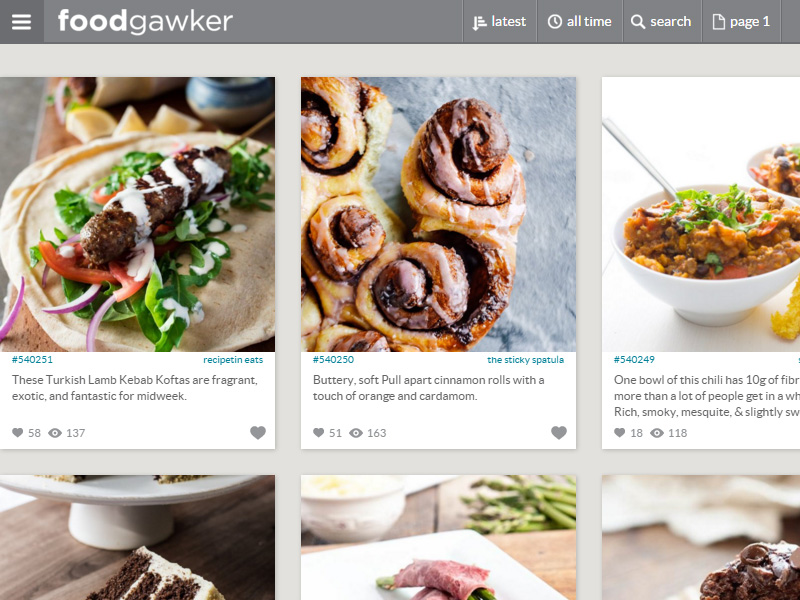
Card / Tile Designs
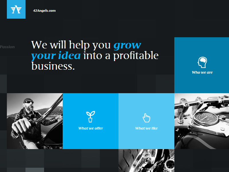
Card or tile designs are very versatile and gives web pages the minimalistic look we spoke about earlier. Utilizing this viewing method, you can cram more into a smaller space without looking cluttered or spam-like. Card designs are a great tool for bloggers or even small business owners involved in e-commerce. The idea is to make navigation as simple as a click.
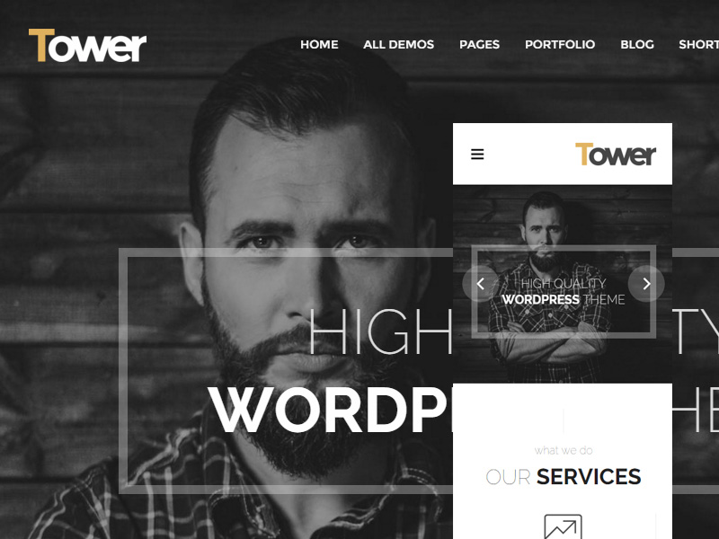
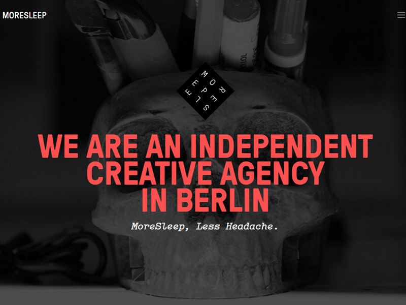
Big Typography
Typography is always a trend and in 2016 it would be a huge surprise to not see big bold font take websites by storm. The reasoning behind this is because big typography makes the structure of web pages and their content stand out. It is easier for viewers to distinguish sections of the blog post when you can see subheadings from a mile away.
Wide Images
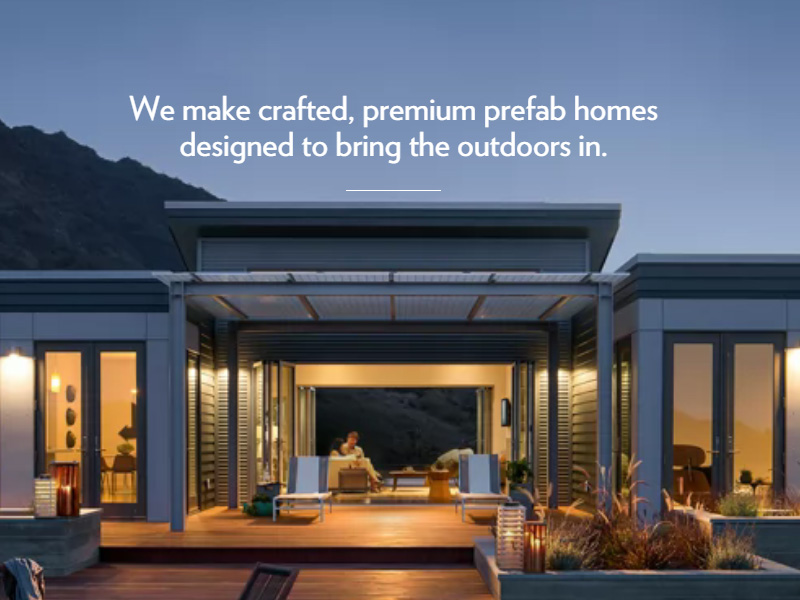
Screen width images make sites appear neater and more visually appealing. When a website that utilizing wide images is viewed from a smartphone, the website looks more interesting than one with medium or small images that make focusing on the content a huge feat.
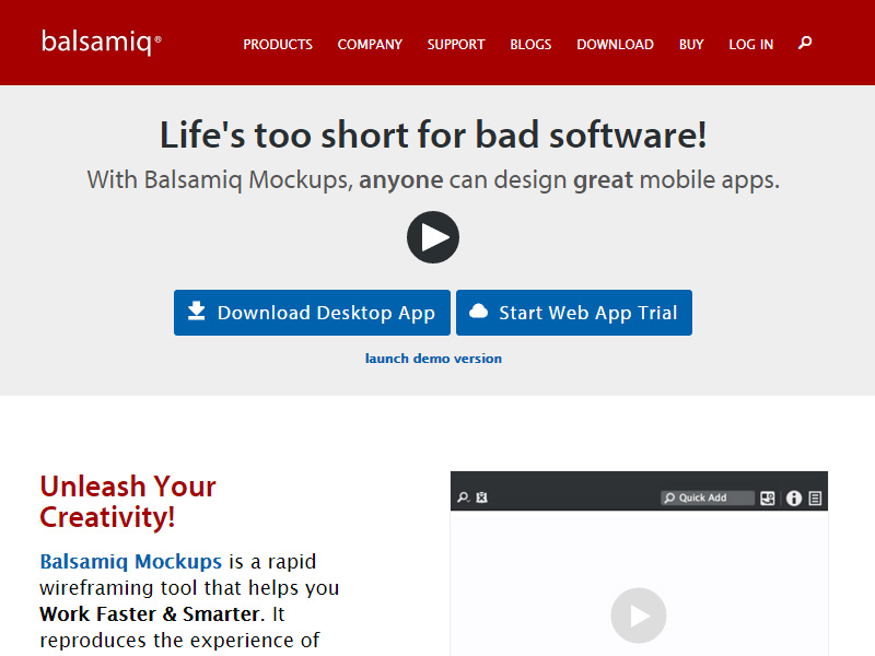
Minimalism & Simple
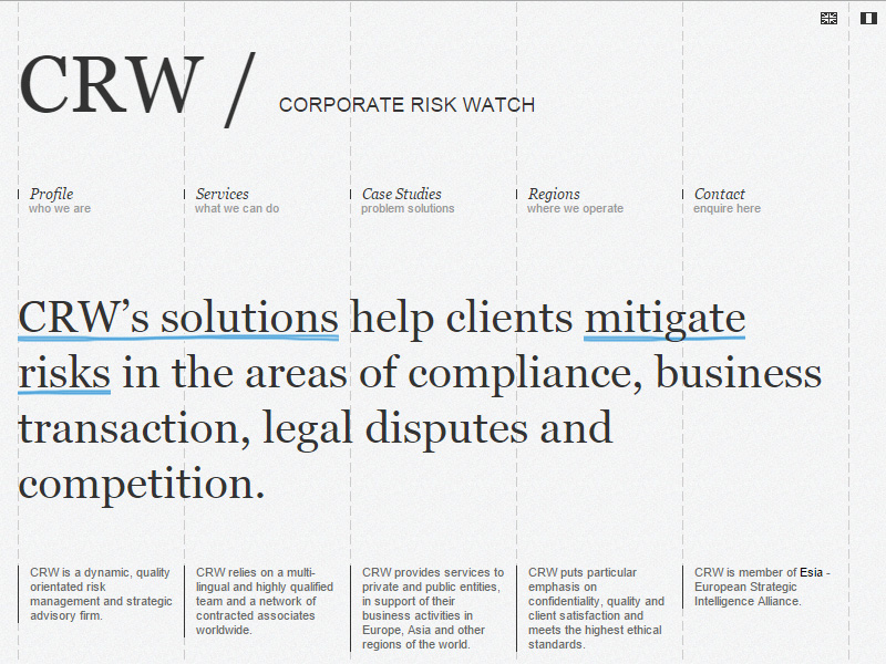
Minimalism is the key to an effective and trendy website. Make navigation easy to use and super simple. The easier the web page is to use, the better.
We have tried our best to cover all necessary information on UI & UX trends. How can you help us to improve UI & UX with new trends ? Please let us know in the comments below!


